If this is your first foray into physically printing your art, welcome! We’re happy to introduce you to the process. This is a collection of tips and suggestions to help your art turn out exactly how you expect it to look when it’s printed.
Quick links: Technical Art Specs | Lulu.com’s Calendar Printing Guide
Image File Templates: Month Image Template | Month Calendar Template
What is Bleed?
Written description: Paper things are printed on larger pieces of paper and then cut down to the final printed size, so that your image can hit the edges of the paper. The bleed exists because cropping the paper down has a bit of leeway in exactly how it’ll crop, so you need to draw your art beyond the edges of the final page size.
Visual description:

Monitor color calibration
A precisely calibrated monitor ensures that the images you are preparing for print are as accurate as possible. Here are some different monitor calibrator tools and methods.
Document color setup & Image resolution
RGB is an additive process, meaning it adds red, green, and blue together in varying amounts to produce other colors while CMYK is a subtractive process that uses different amounts of cyan, magenta, yellow and black to remove reflected colors from paper to create other colors we can see. The two processes have different ranges of color, with RGB providing a wider array of possibilities thus making it used in electronic devices like computer monitors.
Most printing uses CMYK. Because of this, traditionally printers will ask you to convert RGB colors to CMYK before sending our files to the print – and many online tutorials will also recommend you convert to CYMK. However, our printer is modern enough that it asks for sRGB format. Don’t use CYMK for the calendar!
For a more in-depth explanation, here’s a guide by Quilin. It also covers image resolution, so definitely give it a read!
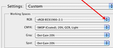
The guide linked above explains how to set sRGB in Clip Studio. To set sRGB in photoshop, click Edit > Color Settings, then:

To set sRGB in procreate, follow this guide.
Make sure your dots per inch (DPI) is set to 300 or higher.
File format
Paraphrased from this guide:
For this project, we ask for PNG files please.
Do not use JPEG because every time you transfer or resave the files (e.g., upload it anywhere) you lose data. JPEG is a lossy file format, meaning that it will pixelate, distort, and blur your image further upon every resave. It’s awful and it will ruin your images.
PNG and PDF are more reliable because they are not lossy files. They will retain every pixel you draw in your illustration.
Unfortunately, PDF doesn’t easily display on most social media. PNG can look bad on social media websites because the website will resize the image while trying to retain all of its information. This can cause it to look too “sharp” on screens and sometimes cause random pixels to appear in the image. However, how a PNG looks on paper will be very different from how it looks on the screen. For printing, PNG will give you the best quality picture you can get on the paper. If you’re really worried about that pixel look, use JPEG for online but don’t ever use JPEG for printing.
Again, PNG files are your best bet for this project.
Darks and lights
Make sure you lighten things SIGNIFICANTLY when file prepping for print; anything dark on-screen will often print as black. Here’s a tutorial:
We hope this helps you get started. You can always ask the mods if you have any questions. Good luck and have fun!